|
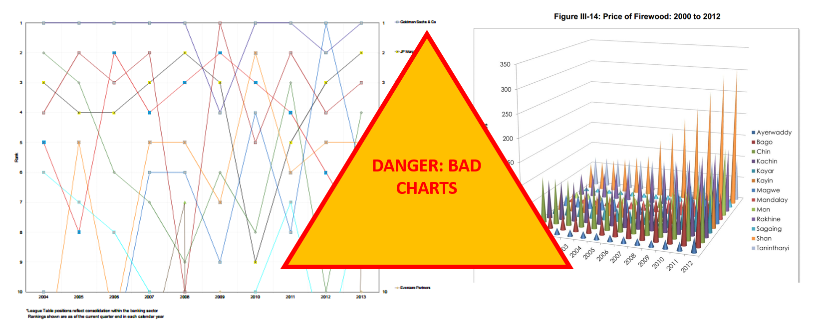
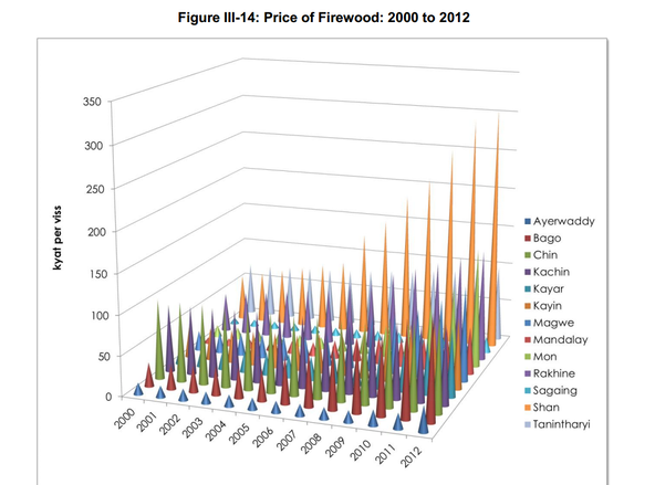
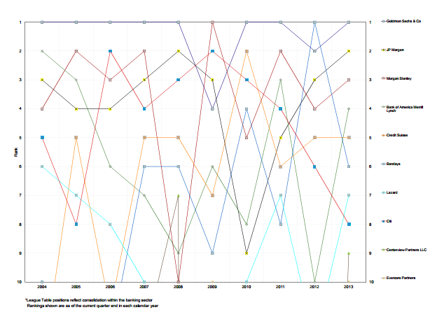
A couple of weeks ago, we wrote a blog about Metrics that Matter, which among other things warned of using cumulative revenue charts. This got us thinking about other charts and graphs that we’ve seen in pitch decks and presentations. Some have been excellent, while others have been distracting and confusing (two things you don’t want your pitch to be!). Therefore, we decided to share some thoughts and recommendations on the types of charts you should and shouldn’t use. First, a very quick introduction to data visualisation (i.e. charts, graphs, tables, etc.). We use visual aids to make it easier to show a trend or phenomenon. If you’ve made a super complex chart that takes more than a few seconds to understand, you’ve failed at data visualisation. This is a comforting thing to be aware of: if you struggle to understand a chart, it’s not you, it’s the chart’s design. Let’s add some rules to what makes a good chart: 1. Efficient- this is like “easier”, it should be easy to read and more efficient than the alternative of writing it out (i.e. a table); 2. Meaningful- pick data that means something, just as investors care more about how much revenue you’ve generated rather than the average time of bathroom breaks your employees take; 3. Unambiguous- if it’s not clear what the data is, then it probably needs a label or shouldn’t be there! Now that we have the rules mapped out, let’s look at some bad charts. What’s wrong with the chart below? For a start, try guessing what the value is for Sagaing in 2003. If that’s not hard enough, try to then compare that to the value of Mandalay in 2010. Now, quickly glance and say which is higher overall, Shan or Kayin. All in all, this graph is impossible to read because the 3D design hides things, colours of series are the same (or very similar) and there’s just too many datapoints. This chart fails all three rules. Let’s take a look at the chart below for another example of bad charts. We’ll let you decide why this one is bad (if you need a hint, just time yourself while you try to work out what’s going on). Not all charts will be so terrible that you recognise them as “bad charts” from the beginning. While it’s pretty easy to avoid making charts that look like those above, there’s a long way between not making those and making good charts. We try to keep our blogs to around 500-600 words, so in the next 150, we’ll set some rules to make life even easier when representing data. A) Don’t use pie charts Simplest rule is don’t use them. If you must, don’t include more than 4 segments. Never compare a pie chart to another pie chart and never, ever, use 3D pie charts. If you’re not sure, revert to the title of this rule. B) Order your data Annual data should typically be presented chronologically, but other data should be presented in a structured way: smaller numbers running to larger numbers, or vice versa – this makes patterns much easier to spot. C) Forget grid lines, use data labels (and bigger fonts) Remember, the idea is to make it easier to read a chart than a table. Looking for the biggest column / bar then checking the axis value and running your eyes along to see the column / bar value is a lot of looking around; instead, use well placed, easy to read data labels. If you want to learn more about good and bad charts, you’re in luck. There are two wonderful resources on the subject we would highly recommend:
Comments are closed.
|
Categories
All
Archives
September 2020
|


 RSS Feed
