|
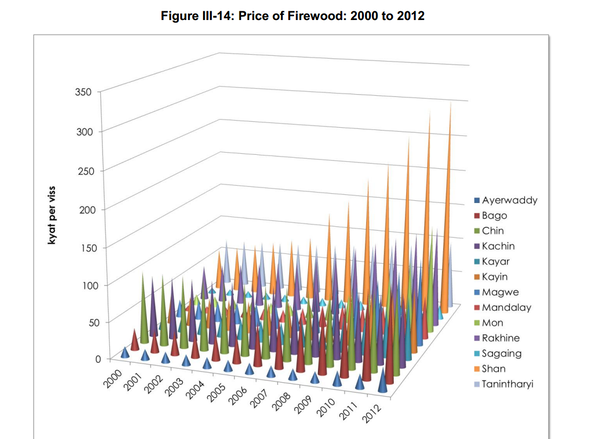
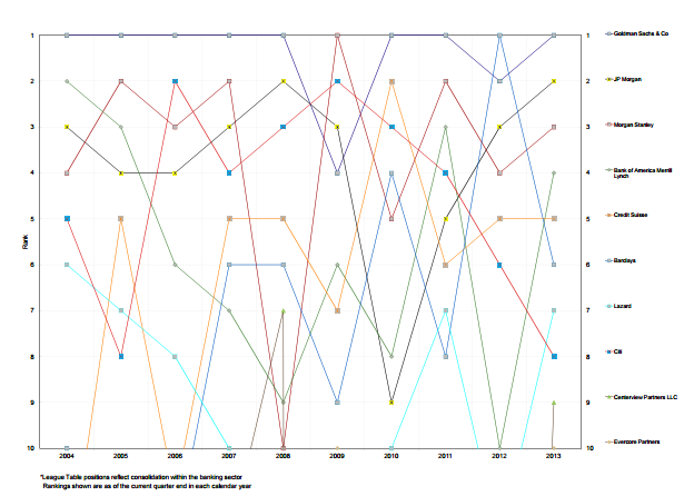
A couple of weeks ago, we wrote a blog about Metrics that Matter, which among other things warned of using cumulative revenue charts. This got us thinking about other charts and graphs that we’ve seen in pitch decks and presentations. Some have been excellent, while others have been distracting and confusing (two things you don’t want your pitch to be!). Therefore, we decided to share some thoughts and recommendations on the types of charts you should and shouldn’t use. First, a very quick introduction to data visualisation (i.e. charts, graphs, tables, etc.). We use visual aids to make it easier to show a trend or phenomenon. If you’ve made a super complex chart that takes more than a few seconds to understand, you’ve failed at data visualisation. This is a comforting thing to be aware of: if you struggle to understand a chart, it’s not you, it’s the chart’s design. Let’s add some rules to what makes a good chart: 1. Efficient- this is like “easier”, it should be easy to read and more efficient than the alternative of writing it out (i.e. a table); 2. Meaningful- pick data that means something, just as investors care more about how much revenue you’ve generated rather than the average time of bathroom breaks your employees take; 3. Unambiguous- if it’s not clear what the data is, then it probably needs a label or shouldn’t be there! Now that we have the rules mapped out, let’s look at some bad charts. What’s wrong with the chart below? For a start, try guessing what the value is for Sagaing in 2003. If that’s not hard enough, try to then compare that to the value of Mandalay in 2010. Now, quickly glance and say which is higher overall, Shan or Kayin. All in all, this graph is impossible to read because the 3D design hides things, colours of series are the same (or very similar) and there’s just too many datapoints. This chart fails all three rules. Let’s take a look at the chart below for another example of bad charts. We’ll let you decide why this one is bad (if you need a hint, just time yourself while you try to work out what’s going on). Not all charts will be so terrible that you recognise them as “bad charts” from the beginning. While it’s pretty easy to avoid making charts that look like those above, there’s a long way between not making those and making good charts. We try to keep our blogs to around 500-600 words, so in the next 150, we’ll set some rules to make life even easier when representing data. A) Don’t use pie charts Simplest rule is don’t use them. If you must, don’t include more than 4 segments. Never compare a pie chart to another pie chart and never, ever, use 3D pie charts. If you’re not sure, revert to the title of this rule. B) Order your data Annual data should typically be presented chronologically, but other data should be presented in a structured way: smaller numbers running to larger numbers, or vice versa – this makes patterns much easier to spot. C) Forget grid lines, use data labels (and bigger fonts) Remember, the idea is to make it easier to read a chart than a table. Looking for the biggest column / bar then checking the axis value and running your eyes along to see the column / bar value is a lot of looking around; instead, use well placed, easy to read data labels. If you want to learn more about good and bad charts, you’re in luck. There are two wonderful resources on the subject we would highly recommend:
We helped Bagan Innovation Technology estimate the Myanmar market size for fortune telling and now we’re sharing how we did that.
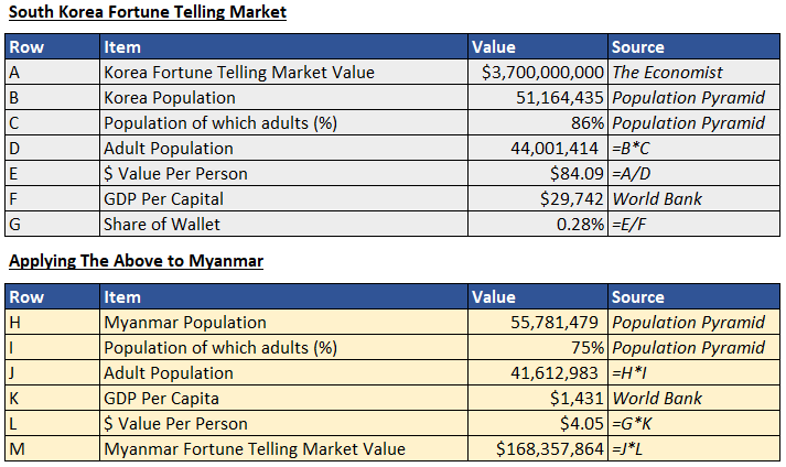
It’s a common sight at startup pitch events all over the world (including here in Myanmar): a founder talks about their product and traction and then claims the market size for their product is hundreds of millions (or billions, especially in larger markets). If the entrepreneur can access just a tiny percent of the total market, they can achieve revenues of $2-3m in the next two years, even though revenues today are non-existent. We can’t blame entrepreneurs for this: with a few minutes to impress, they need to use big numbers and we’re always telling entrepreneurs to think big. But things can often fall apart when the entrepreneur is questioned about their assumptions behind the market figures. Market sizing is the process of estimating the total dollar potential of a market. Simply put, how much money is spent in total in your target market? Example: we estimate that the total amount of money spent on fortune telling services in Myanmar is around $200m. You’ve probably heard about TAM, SAM and maybe SOM. These are Total Addressable Market (TAM), Serviceable Addressable Market (SAM) and Serviceable Obtainable Market (SOM). There’s plenty of definitions for these elsewhere so we’ll skip over them today, just know we’re talking about how to estimate the Total Addressable Market, which is total annual revenues in a market – this is the first number you’ll need before estimating anything else. Top down or Bottom Up There are two approaches to estimating market size: top down and bottom up. Top down approaches start with a big number and – you guessed it – work down. If we know the total amount people spend on grocery shopping, we can make some assumptions about how much people spend on particular products (i.e. 5% of their shopping basket is onions, so the market size for onions is 5% of the grocery shopping market). However, in Myanmar good data points can be hard to come by. What we often do, therefore, is look for a comparison country and work back. In our example, we saw that The Economist (a reputable newspaper) claimed the market for fortune telling in South Korea will soon be $3.7bn. Top Down Now, Korea has a similar size population to Myanmar, but incomes are much higher. Therefore, we want to find a way to apply the Korea results to Myanmar. Here’s how we did it: we worked out how much % of their income Koreans adults spent on fortune telling and applied this to Myanmar adults. The result was that people spend around 0.28% of their annual income on fortune telling. In Myanmar, that’s a $168m market.
Bottom Up
Bottom up approaches start from the smallest number and work up. If we’re talking about onions, we’d find the price of one onion, then estimate how many onions people bought on average each time they shopped, how many times a year they shop, etc. until we got to the total market value for onions. For fortune telling, we did the same: take the average price for fortune telling in Myanmar, how many times would people go to a fortune teller in a year, and how much of the population uses a fortune teller. This approach gives us a total market of $222m.
Which approach to use?
The simple answer is both. But we like bottom up approaches as it shows you’ve thought about the actual occurrences required to build the market size (rather than abstract numbers without much real-life meaning). Taking the time to go through both approaches helps you triangulate your results. In the top down approach, the only assumption we make is that people in Myanmar spend the same share of wallet on fortune telling as people in Korea, but this is a huge and hard to test assumption. In fact, when we do our bottom up approach, we estimate people spend on average around 10,000 MMK ($6.6) which is closer to 0.5% of income (this highlights the abstract nature of top-down approaches). Also in bottom up, we assume 40% of the population uses fortune telling services - this feels right to us based on our market knowledge and is a number we’d happily defend. In our case, as the discrepancy between the top down and bottom up approaches was rather small, we decided to take the average: $194m (hence the “around $200m” at the start of this post). Taking the average lets us not be too bullish and allows us to better defend our estimations. However, as you can see the bottom up approach just makes a lot more sense and is easier to understand. In all likelihood, the fortune telling market in Myanmar is more than $200m. Note: $194m is a huge, huge market for Myanmar. Fortune telling is a fundamental part of culture and something people are already consuming. We would not recommend trying to come up with a number, but instead following these processes to get to a result. Don’t worry, we’ve invested in markets as small as $20m. Yes, large markets are good, but it all depends how much of the market you can take and how fast the market is growing. Our advice is to be honest with yourself (and others) about market size and use this to guide your market strategy. Stuck on market-sizing? Get in touch with us at [email protected] and let us know where you’re up to. We’d be happy to share some ideas! |
Categories
All
Archives
September 2020
|


 RSS Feed
